As promised, here's a breakdown of the revisions the Bike Glider Flying/Crashing Scene went through!
Some of you gave me some much needed input about this scene before it started to unfold. Just so you know; I am thankful for every thought and analysis regarding this scene, it helped me make it much better. I know what I have now is not 100% realistic, but I think it serve's its purpose (to be dramatic, fun and comical). I hope you think so too!
Keep the comments and analyzing coming! It's going to be quite a challenge to draw the real juicy flying scenes in the future. I'm always happy to hear what you think, even if I don't make changes. Sometimes the feedback will come in handy later - either in future pages or in edit-runs of old pages! :)
Anyway, so about this flying/crashing scene of Chapter 2! It's undergone a lot of revisions the past years, and I will share the major ones.
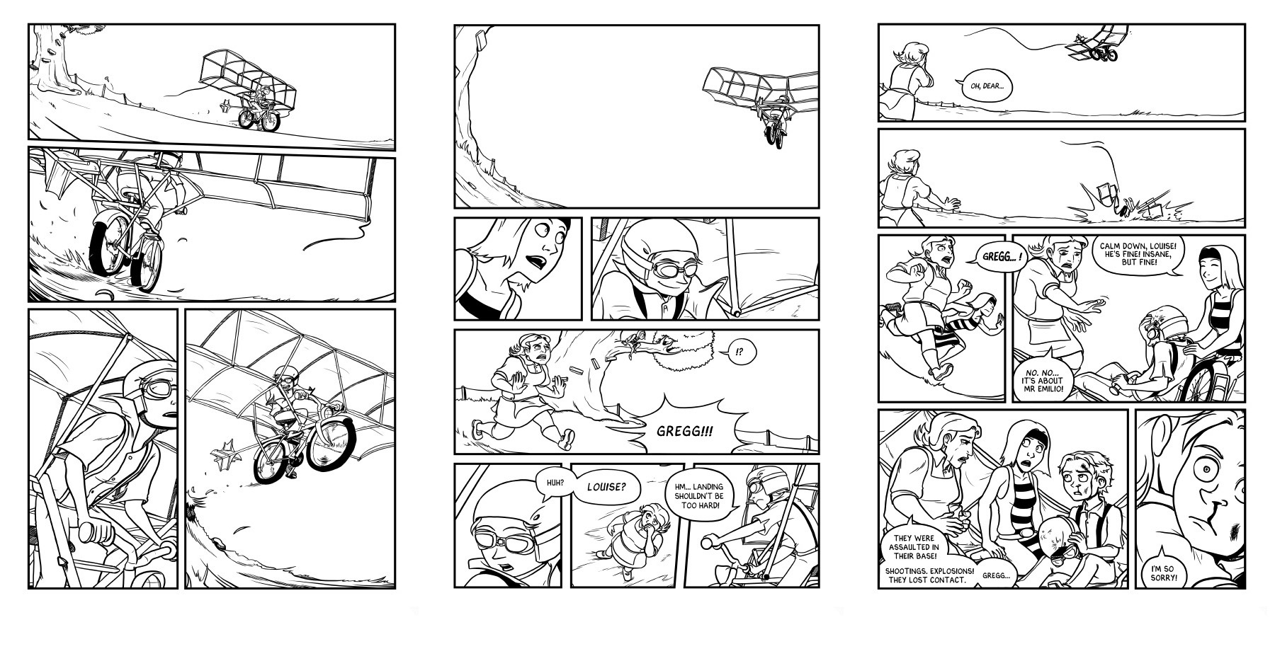
The first one being the old test-version of the comic, when none of the pages had color (drawn in 2012-2013).

1 - 2 - 3
The scene was short and snappy! Most of the scenes were, because the chapters were much shorter back then. My proof readers told me that making the scene a bit longer wouldn't hurt. It's a happy moment to flight-test an invention, especially one that is more advanced than a kite. It was a bit of a disappointment that it ended so abruptly.
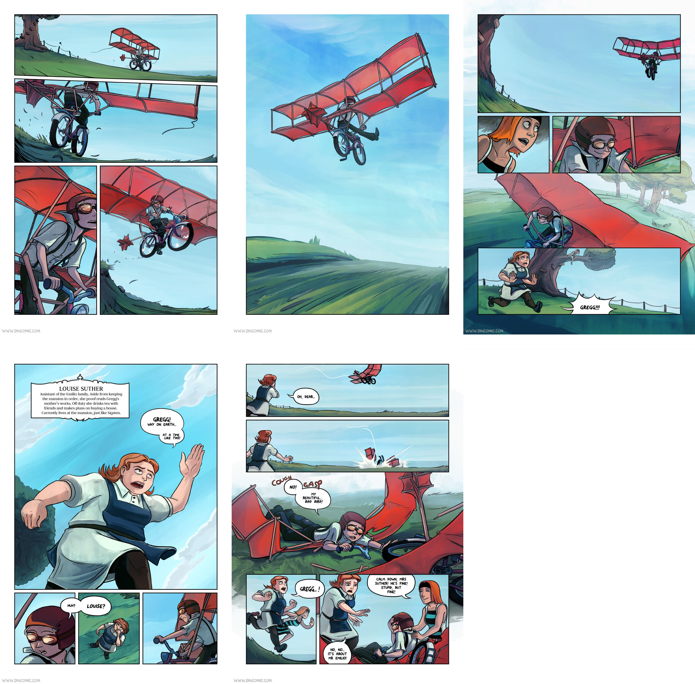
So I went ahead and added a splash page to make the scene longer. I also added an extra panel where Gregg is grinning like mad in the air. An other reason to make these adjustments was that the comic was in need of more lighthearted stuff.
This was the result of drawing new panels and reusing old ones from the old testversion of the comic (2015 - colored 2016):

1 - 2 - 3 - 4 - 5
This is what I had planned to post before I read the speculations regarding how well (or how bad!) the bike glider theoretically would fly. I quickly realized the version I had planned out wouldn't fly (yay, pun)!
The way I had it drawn/paced, it suddenly felt like Gregg spent way too much time in the air before crashing. I recently added Louise info-page to the scene too, while he's in the air, which was an unfortunate spot since it made the flying seem even longer. But it was the only good spot for her info-page to appear at this moment...
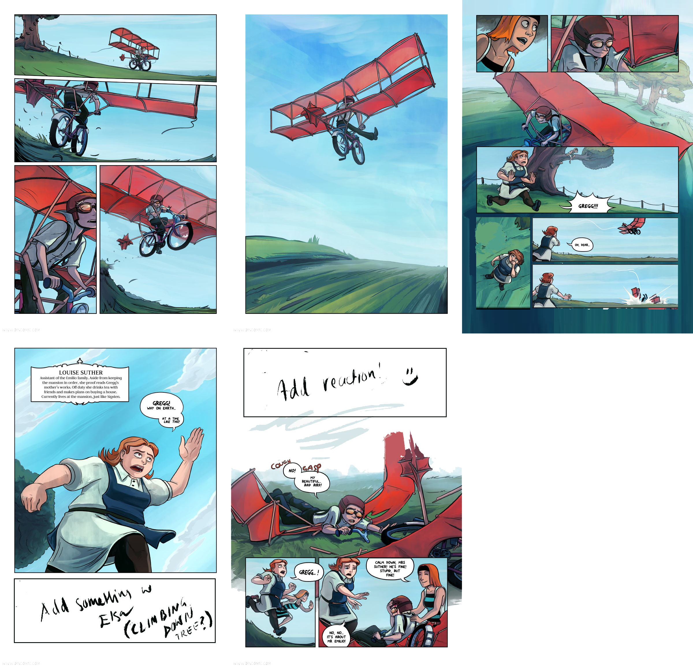
I shared my dilemma and a new set of change suggestions with fellow comic artists (Thx Comic Tea Chat!) and proof readers (Adrian being one of them!). Eventually ended up with this (2016 - just recently):

1 - 2 - 3 - 4 - 5
Got some feedback and new ideas on how to make it even better. Removed some more unnecessary panels, flipped the flying middle panel and added a disappointed Elsa.
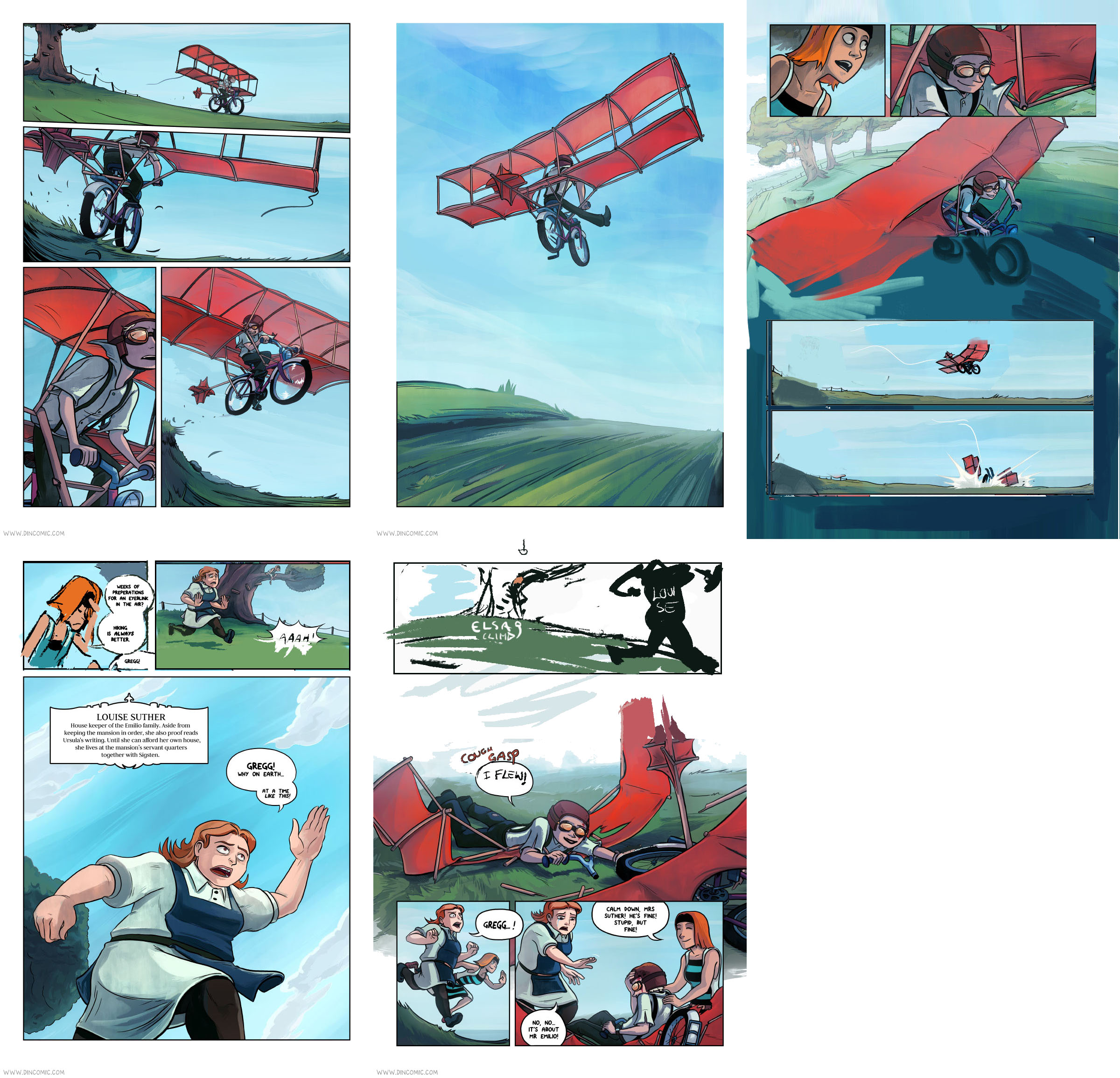
And eventually I ended up with a draft of the version I have up today (2016 - just recently):

1 - 2 - 3 - 4 - 5
It took a few days of removing panels, adding new panels, rearranging existing panels and extending a couple of panels. But I am happy I did it, because I think it flows much better now. It doesn't feel like he spends minutes in the air anylonger. What I am after is a few seconds, but that it feels longer in Gregg's mind. I hope I achieved something close to that. :)
An other important change that was made: Gregg now smiles after the crash (thanks Adrian) + updated line. It seems much more suitable for the kind of spirit he has. I am not sure why I drew him with such a painful face at first - perhaps because it must've hurt A LOT and I have a habit of tormenting my characters? *shrugs* I'm going to treat them better from now on! (Maybe)
Thanks for reading and thanks everyone for the input! :3 I truly mean it! Your input made me push this scene further, and for that I am grateful!
Onward to the next challenges!
Up up, and away! ~